When business owners discuss Search Engine Optimization (SEO) with us what they are basically saying is they want to bring people to their website “now!” and it doesn’t really matter how they get there. Well, it does matter “how” you get people to a site and it also matters “why” you are trying to drive them there in the first place. If visitors go to your website and aren’t satisfied with what they find there then they don’t ultimately become customers. And getting customers is what the SEO game is really all about.
Heading into 2013, here are 5 current trends to consider with regard to your website and your overall on-line business presence.
1. Do you have a Responsive Website? – New to 2012, a responsive website is designed to adjust itself to size when it is viewed on a wide screen monitor, iPad, laptop or smart phone. You can check to see if your own website fits the bill. How? View the website on your computer screen, click to minimize the screen and then click and drag the sides of your browser window to resize the website’s width. If the website still looks good, and is easy to read and understand, then it is probably adequate for today’s web design standards.
2. Consider a Blog on your website – a blog is a great way to start a conversation. If you have ideas or knowledge to share with others why not put it on your own website to attract potential customers? You’ll build your online credibility with not only people, but the search engines as well.
3. Use social media and tie it to your website – If you own or manage a small business and are not using social media, then you are missing out on one of the most cost-effective tools available for promotion, branding and customer service. Twitter, Facebook, YouTube, Pinterest, etc. are all free and user friendly. At the very least, every business should have a Facebook company page! After setting it up, link your website the Facebook page and/or use a widget to feed the posts to your website for viewing.
4. Get on LinkedIn – every businessman and woman should have a LinkedIn account. It’s free networking!
5. Optimize your online presence as much as possible – perform a Google search on your business name to see if and how it is listed. Review the search results to see what’s what then take steps to build or improve your online presence. If you have a storefront, claim your local business listings and optimize the information with more details—business hours, logo, videos. Consult a professional to optimize your website for higher technical functionality, analyze keywords in the content, and increase visibility with the search engines. To see examples of online business listings, do a Google search on “Gallop Web Services, LLC”.
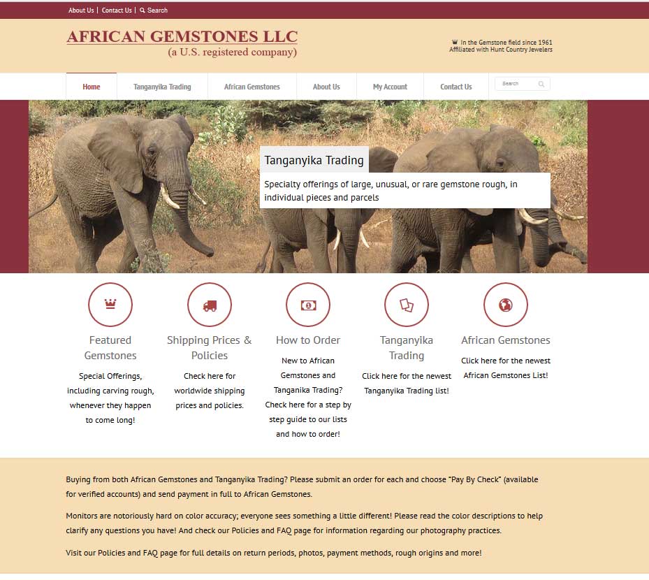 We enjoy the work we do for all our website clients however we sometimes have the pleasure of building a truly unique product site that offers a niche service. An example of such a website project is African Gemstones. This particular site is ecommerce specializing in the sale of precious and semi-precious gemstones in the rough. This means the stones have not been polished and set, and basically come straight from the mines in South Africa. People who are interested in gemstone rough would be jewelers and occasional hobbyists. It was so interesting to learn about a product we know nothing about and incorporating into the website beautiful photos of South Africa taken by co-owners Logan and Carolyn Cutshall on their various trips to South Africa.
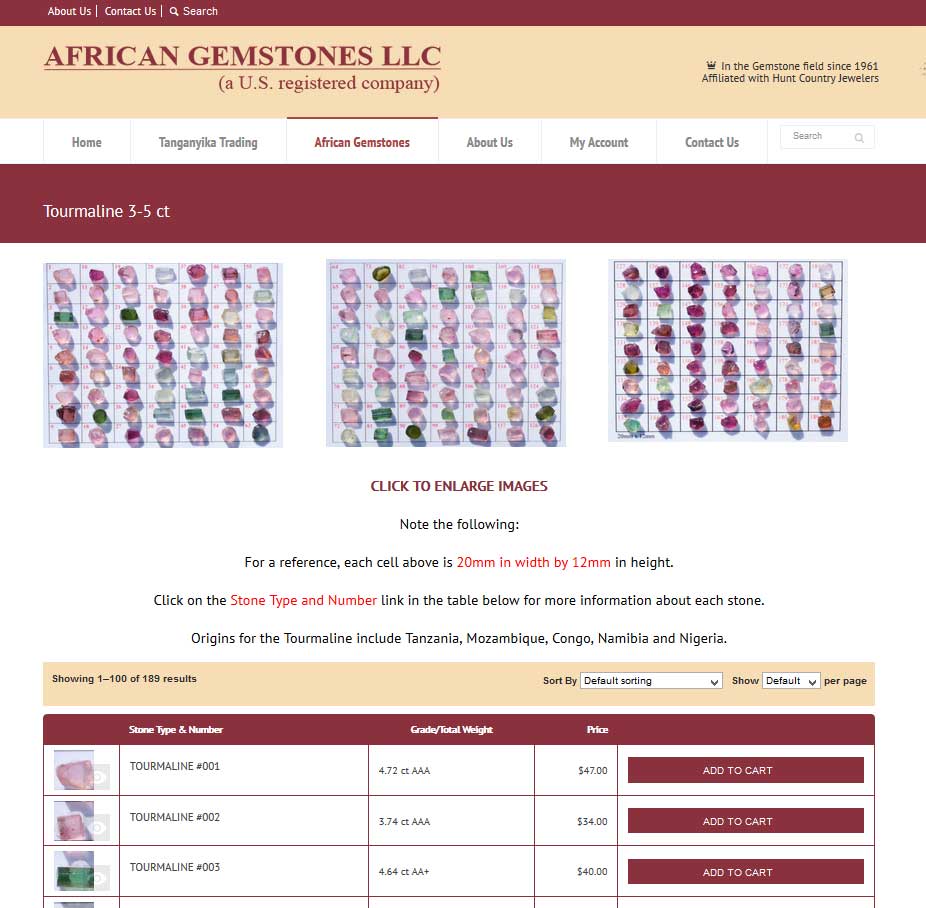 One of the special touches we applied to African Gemstones is a table display layout of the gems. It is user-friendly providing a scrollable view of the gemstones by category. The purchaser selects any and all gems and can go straight to checkout, if they so desire. Quick, easy, and attractive to use.
