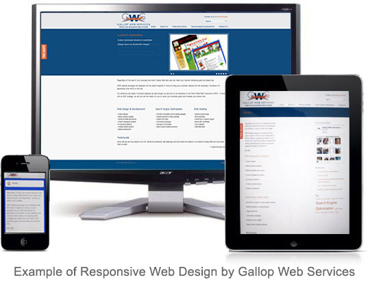
What is Responsive Web Design?
“Responsive Web Design”, is the buzzword of the year and we’re sure you have been seeing the term used a lot lately. But as catchy as it sounds, what responsive web design really boils down to is making sure a website will look good and function well no matter what hardware device is utilized. For example, if a smart phone is being used to, say… order pizza through a restaurant’s website, then for a positive consumer experience the customer needs to be able to navigate and type easily on his smart phone without having to hunt and peck for how to process his order.
To be responsive, a website needs the following key items:
- Context-aware images: fluid images, which appear larger or smaller, depending on the viewing mode. These are also known as responsive images.
- A flexible, fluid grid: a layout that is easy to resize, designed in terms of proportions. It can easily adjust to the device where it’s being viewed.
- Media queries: these queries allow you to collect data about the site visitor and apply particular coded styles based on the user’s device, or resolution.
As more and more consumers rely on mobile devices, iPads and tablets, many companies are having to build several sites for different platforms, or provide one hub for content that will respond to the user’s particular device. The challenge to web developers is building a website with long term uses in mind. This is an important step as–in our opinion–the demise of the desktop computer is probably not far off.
In general, Responsive Web Design is less about technology and more about design, and using a set of techniques to present the website content to the viewer based on his or her device of choice. To test if a site is “responsive” on your desktop, you can stretch the screen width back to be larger and smaller, and see the site layout adjust itself to fit to the new width. If it doesn’t, then it is fixed width and less likely to render well across multiple device uses. If you have various devices, take a look at Gallop Web Services website to see how it adapts to different device uses.

 To strengthen your emails and on-line newsletters, here are eight tips to keep in mind and get customers to take action.

